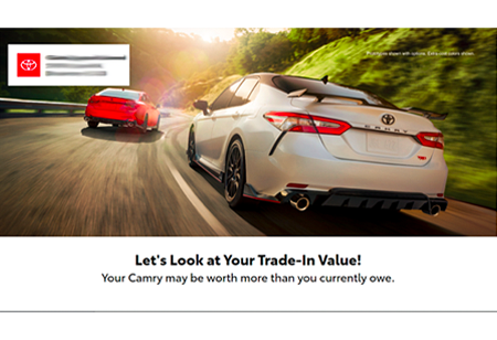
Our newsletter template: Redesigned by design.
Jun 30, 2015At DSplus, we’re constantly looking to rev up the quality of our dealership program. One such endeavor was a redesigned newsletter template, which recently went live. In identifying the best-performing design, we tested different templates extensively, using scientific methodology and experimental models. While our new design is easy on the eyes, there’s also substance behind the style. Aside from putting an edgy, modern spin on the overall look, the main goal of the redesigned template was to increase customer engagement.
Here’s how we approached the redesign:
- Over 50% of our customers browse our newsletters on their mobile devices, so we took a mobile-centric approach for a more user-friendly experience.
- We also learned that the vertical navigation menu on the left side of the newsletter wasn’t optimal for viewing on smaller screens, so we designed a horizontal navigation menu across the top and included another in the footer.
- Research also indicates that communications with images tend to have a higher click-through rate than those without. As a result, the sleek new design makes images the focus of our newsletters.
Moving forward, we’re confident that more potential customers will engage with Toyota content—and even more will visit local Toyota websites.
Nothing makes us as proud of our work as hearing our dealers say we’ve made a crucial difference to their bottom line. It is, after all, the little things that make a big difference.
As we like to say: It all adds up.


